BAG (0)
By purchasing Route protection, you ensure your EyeSwoon order is covered should the unpredictable occur. Replacements or refunds are often processed within a matter of hours by the Route team.
View My Bag
Design:

Interior Designers Share Their Go-To Paint Colors for Small Spaces

Words by Sacha Strebe.

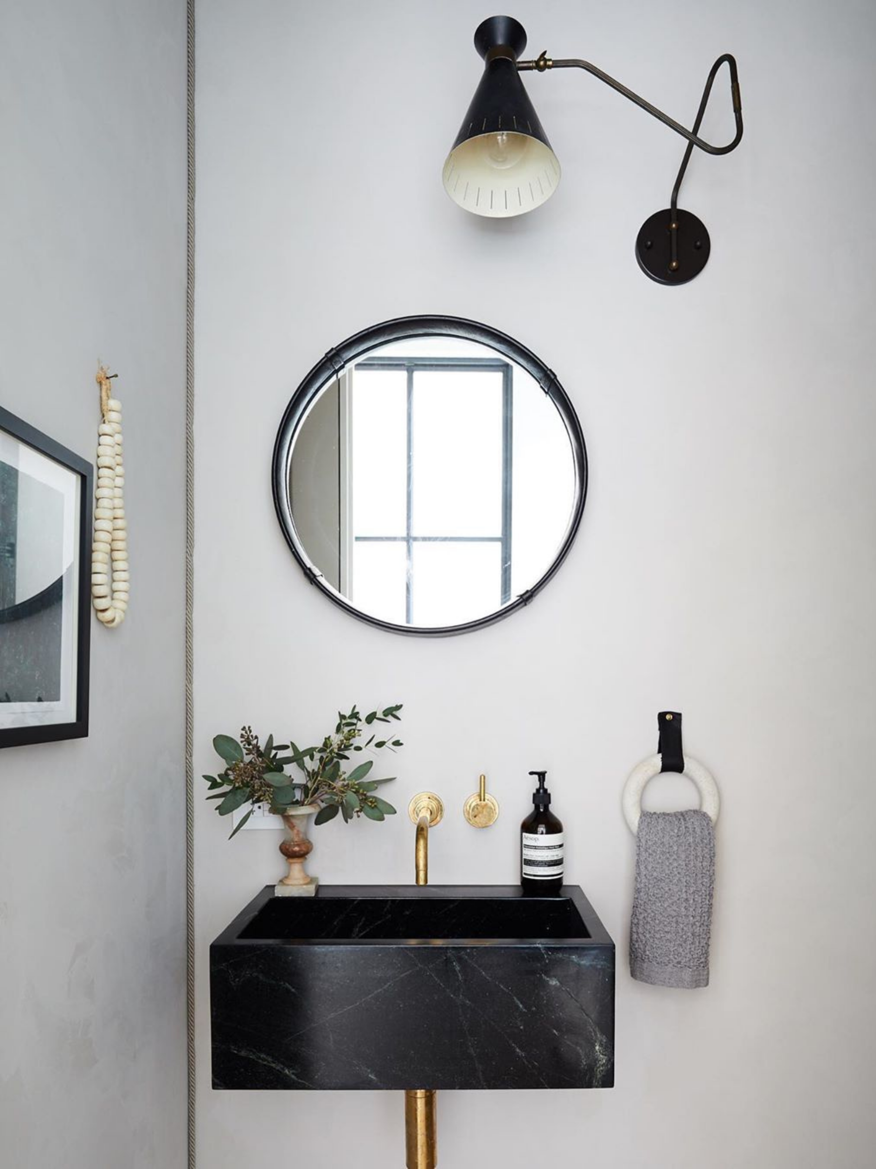
As disciples of contrast, it makes sense that we’d welcome constraint. In fact, we revel in the challenge, especially when we’re presented with a space that has restricted square footage. What could be better than turning perceived drawbacks into stylish solutions? So when presented with the common problem of sourcing the best paint color for small rooms, we were only too happy to oblige. While we have our own thoughts on what hue works best, we turned it over to our fellow interior design friends to share their favorites.

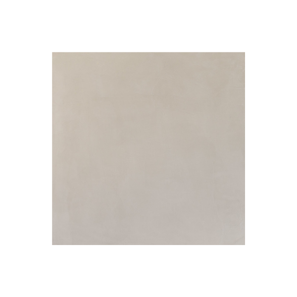
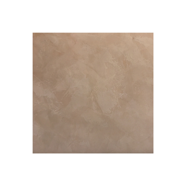
So, keep reading to discover the best paint color for small rooms. The secret? A little texture via Roman clay.

Nicole Franzen
Nicole Franzen

Athena Calderone, Interior Designer, Author, Chef, and Founder of EyeSwoon

“Much like the beautiful lining on a jacket, the hidden details of a room are what I love most about design. I like to wield these understated design elements to engage curiosity and optical intrigue. Paint is definitely one of those tools I use often to add contrast, depth, and texture, especially in a diminutive space. In my Brooklyn townhouse, a huge part of the design process was collaborating with the plaster aficionados at Kamp Studios to bring back the old-world sculptural detailing and wall paneling into the space. While Farrow & Ball Wevet was used throughout much of my home, I had the Kamp Studios team apply Portola Paints Roman Clay in Burrow in the petite parlor bathroom on the ground floor (hidden behind a secret door at the end of my floating marble kitchen shelf). The textural effect of the wall’s surface further proves that neutrals can in fact be rich and layered.”

Tatum Kendrick, Founder/Creative Director, Studio Hus

“I love Farrow & Ball’s Cromarty because it’s a fresh pastel with enough dirty undertones that it doesn’t go too sweet. I also recommend wrapping walls, ceilings, and millwork in small spaces to open the space. I used this paint color in a small butler pantry in the Hamptons (pictured) where I wrapped the walls cabinetry and ceilings in the same color. I love the monochromatic approach which opens up the space and gives you a maximalist approach without overwhelming the room.”

Peter Margonelli
Peter Margonelli

Tatum's Pick:

Michelle Mosqueda
Michelle Mosqueda

Julie Van Daele, Founder & Principal Designer, Well Recieved

“This hue is the perfect blend of warmth and light. It makes the room feel larger while also adding texture and personality. I’ve used Portola Paint Roman Clay in Charleston in a kid’s playroom, a powder bath, and even a living room with low ceilings. It totally opens up the room.”

Gillian Segal, Founder & Principal Designer, Gillian Segal Design

“When it comes to small spaces, I think a common choice is a light color (white) to make things feel brighter and airier, however, I am all about going bold in a small space with a dark or saturated hue, or even a super textural wallcovering. My current personal favorite? Farrow & Ball’s Card Room Green (pictured). I am also a huge fan of Farrow & Ball’s Salon Drab right now. Despite the popular opinion that a dark hue can make a space appear smaller, I actually think it adds beautiful dimension and intimacy. Sometimes instead of trying to disguise features of a space, I like to embrace and lean into them. If a room is on the smaller side, creating a cozy and inviting space is key.

“I have used F&B’s Card Room green in an office where we “dunked” the room in this hue (our term for painting out everything including casings and doors) for an extra luxe feel. We have also used this color in small rooms as a contrast trim detail or as cabinetry for those who don’t want to commit all the way. The main workroom in our studio is painted in F&B’s Salon Drab and it is truly the richest, most relaxing hue.”

Nick Mele Photography
William Abranowicz
William Abranowicz

Sandra Weingort, Founder and Principal Designer

“I am currently obsessed with Benjamin Moore’s Onyx White OC-74, in a matte finish (not flat). I often translate this color into a hand-rubbed plaster when budget allows. It is the most flattering of neutral colors and it gives small spaces a very bright but interesting, warm, and subtle feeling. It is somehow a very modern color but feels very timeless. The color is so subtle and delicate, that it changes dramatically depending on the light in the space, so I always recommend reviewing samples in the actual room where it is being used. I have used it at the entry gallery in a residence I just completed, and is the beautiful background to a gorgeous collection of art. I have also used it in a bathroom where it mixes beautifully with natural materials like white oak and marble (image attached). I am looking forward to finding the courage to use it in an entire home.”

Erin Hiemstra, Founder and Interior Consultant,

Apartment 34

“The best paint color for small spaces is Gravel Gray by Benjamin Moore. I love deep, saturated colors for smaller spaces and this hue offers a lovely cocooning feel. I’ve used Gravel Gray for things like dens (where I used it) or in powder rooms where you want some drama.”

Seth Smoot
Seth Smoot
Michael Clifford
Michael Clifford

Jake Arnold, Interior Designer and Co-Founder, The Expert

“I love using Farrow & Ball’s Dimity in small spaces. It’s warm but it has a depth to it, creating a feeling of a dimly light space while creating shadows and richness. I have used this in most homes we’ve worked on, particularly in older style homes as the paint color almost has a heritage white sensibility.”

Jake's Pick:

Lauren Piscione, Creative Director and Principal, LP Creative

“I prefer to lean into size when it comes to painting small spaces. As opposed to selecting colors that aim to make the space feel light and airy, I gravitate towards deeply pigmented tones that envelop you and make you feel held. Presidente from Portola Paints has a deep earthy tone of desert sand and a rich warmth and obvious nod to nature that creates a sense of calm. It’s both impactful yet not overwhelming—to me, it is balance. I recently applied this color in my client’s “glam studio”—a small extension of the home intended for my client to get ready with her stylists for big events. We wanted to create a space that felt creative but one that could also be a calming environment in often chaotic scenarios.”

Courtesy of Lauren Piscoine.
Share this Swoon –