My Brooklyn Townhouse Design Process
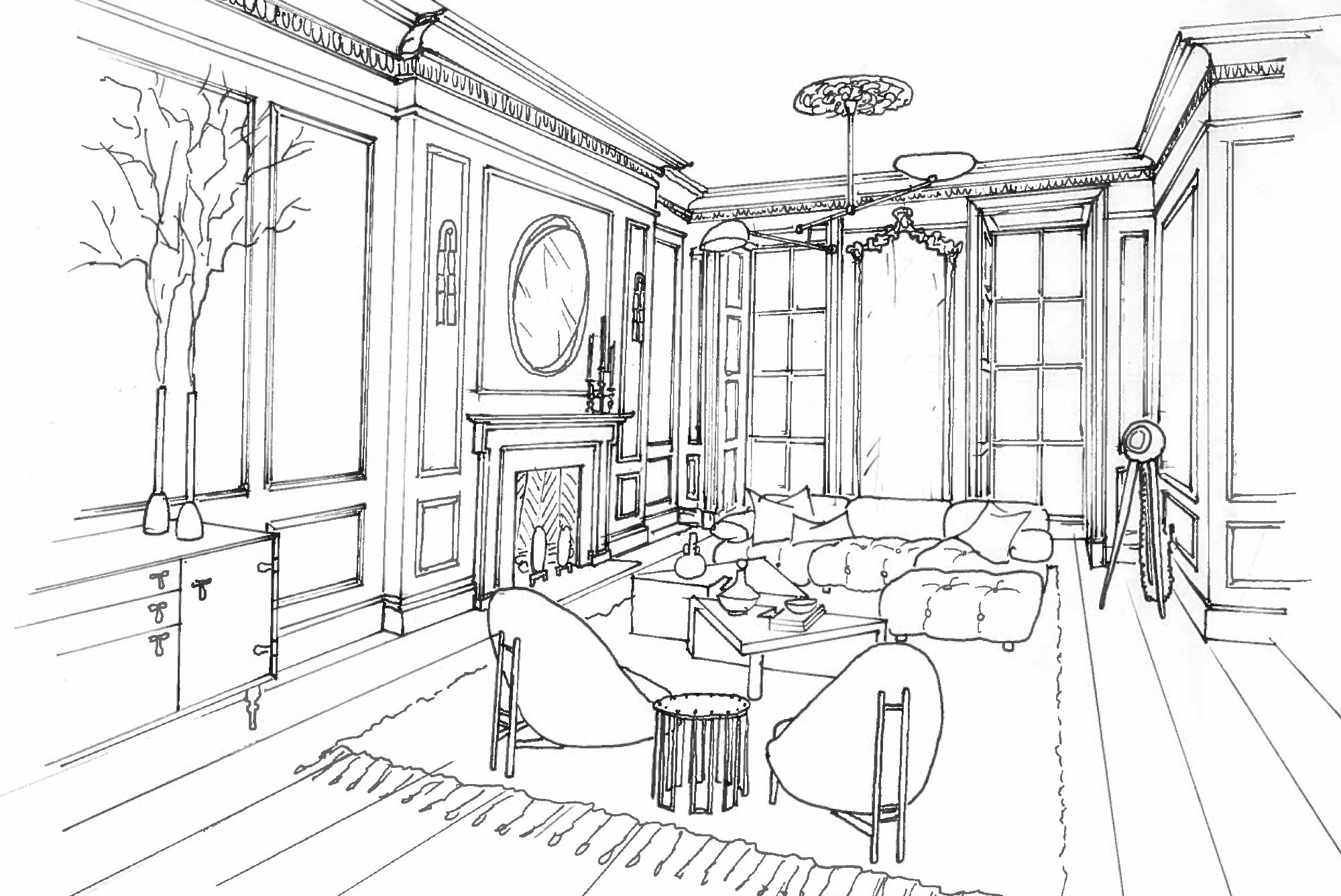
Sketch by John Rawlins.
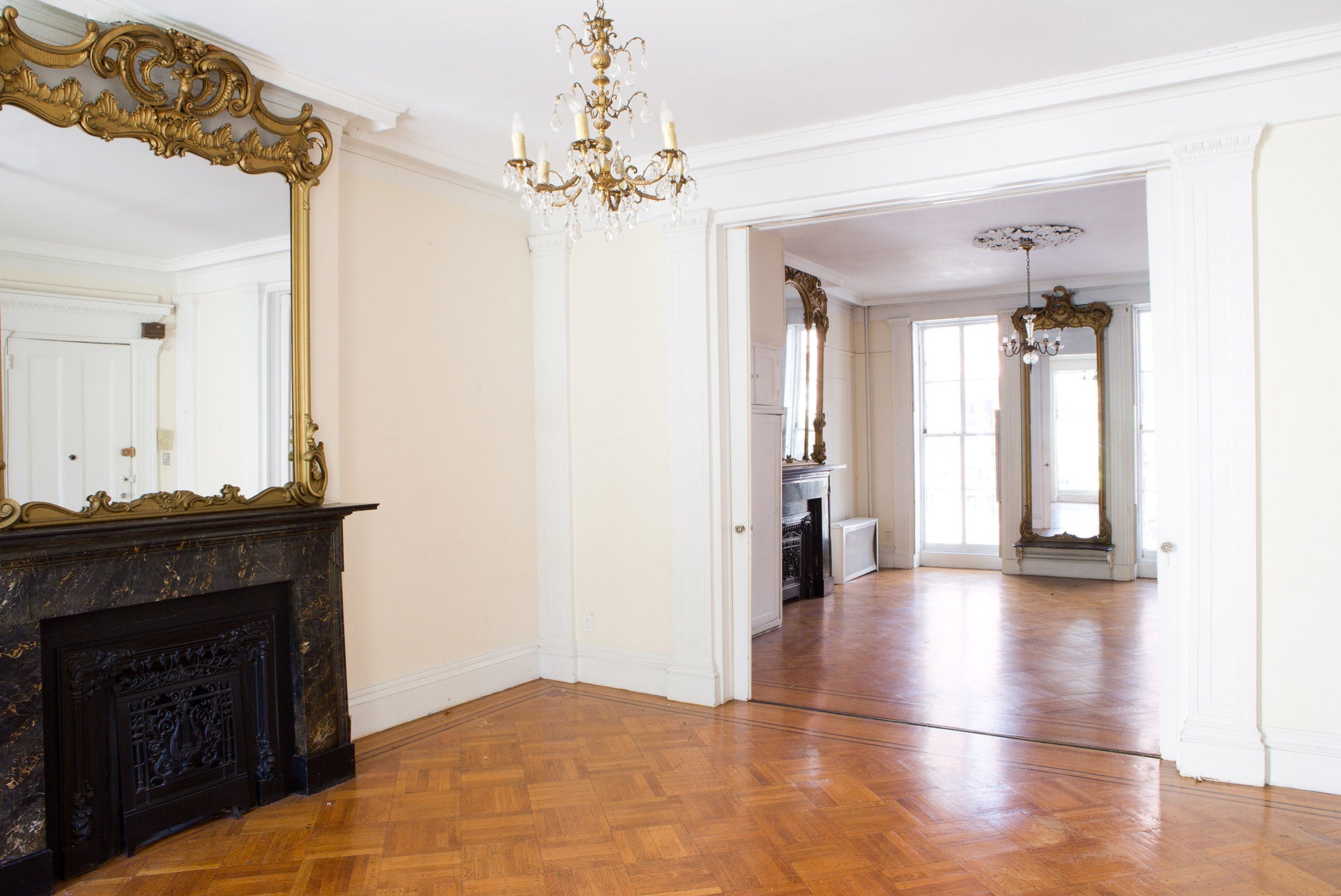
Original townhouse photography by Sarah Elliott
The process behind Athena Calderone’s Brooklyn Townhouse…
Here we go! With our new townhouse begins a new design adventure and one, unlike anything I’ve experienced. I sold my much swooned-over Dumbo penthouse in July 2015 with the intention of staying in the neighborhood and purchasing a new loft. This is what I do. I love nothing more than to challenge my design capabilities, reimagining and reinventing a space by fusing opposing styles with a specific point of view. Anyway, the story goes like this. My family and I went into contract on a corner loft in a premiere Dumbo building, a unit with tons of windows, sunshine, and views, that we had swooned over for years. It was finally within reach—or so we thought. Instead, the deal turned sour after I had already designed the entire apartment, top to bottom, reconfiguring the floor plan and choosing every light fixture, every doorknob, we lost the apartment, along with our hefty deposit. Ouch!
This was already our home in my mind. I was crushed. A real estate frenzy began, as we had no place to live. I started to explore moving outside of Dumbo, the place I have lived my entire adult life since I was 22. I spent countless hours scouring Zillow, The New York Times, and StreetEasy to find just-listed apartments and homes. I explored moving to Manhattan to be closer to our son’s school, and I looked around in Bed-Stuy at the dreamiest ornate townhouses and thought, hey, we were pioneers in Dumbo early on, we can do it again! But the reality was, we were in our 20s then, bright-eyed and open to adventure and something new. Now as a family, we were used to the conveniences of an established neighborhood and the proximity to Manhattan. There was a great silver lining to realizing Bed-Stuy was not for us, however, it also opened our eyes to townhouse living. This sent me on a new mission.
Follow my “Townhouse Living” board on Pinterest to see more of my inspiration for this home.
I have always wanted to design a townhouse. That meld of traditional architecture with ornate crown moldings juxtaposed with hints of modernity—it was a balancing act I yearned to embrace, and I dreamt of how I would color the home with an obvious rejection of conformity. I swoon to collide classicism with Bohemian or Scandi accents, or a touch of Paris with a bit of Brooklyn. There is a grandeur, a grit, and a reminiscence of the yesteryear days of old NYC that lingers between those brick walls. I was itching to get my hands on something that scared me a bit, and something new since condos really encompassed the majority of my design work for my own homes as well as those of past clients.
However, my husband was never swooned by townhouse living. He was always concerned about limited light, compartmentalized rooms, and verticality. I have been gently nudging him to reconsider for years and years—planting the seed, so to speak. As he softened to the idea, the true focus became finding a wide townhouse, since we have always lived in open spaces. We wanted something with ample light, southern exposure at the back, and in close proximity to the subway. This was a tall order, particularly with a limited budget.
We spent the next three months searching for something that suited our super-specific prerequisites. We went through the usual protocol—viewing a house multiple times with our broker, having it inspected with an engineer, putting in an offer, having the offer rejected, putting in a counteroffer, having the offer accepted, and then finally, just when we thought it was ours… LOSING the house to someone else. This happened four times in a row. After a pretty stellar 15 years juggling real estate with intuition and grace, I was convinced our “winning” streak was over. It isn’t easy feeling untethered and without a home. It was hard on us all as a family.
After this long, winding, and bumpy road, we were somewhat flexible, okay perhaps desperate, to secure any location. But then Victor, who was now fully wrapped up in the search, found a townhouse in Cobble Hill—and one that could actually fulfill his desire for vast open spaces, something he previously thought could only exist in a loft. He had found our home. And he literally bled for it. At the first viewing of the townhouse, Victor clonked his head on a rusty nail protruding from the hallway. Blood poured down his face, our long-term broker had to call 911, the ambulance came, stitches were sewn, and needless to say, it was quite the ordeal. We joked that we just had to get this house, Victor’s blood literally stained the walls!
We felt extremely fortunate to go into contract on our Greek Revival brick townhouse, built in the late 1800s, in the historic section of the neighborhood. Located on Pacific Street, the most charming tree-lined road, the house stands four stories tall and an impressive 25-feet wide.
Putting Down Our John Hancock
When we purchased the home, it was broken up into four apartments, with tenants occupying each floor. This deterred most potential buyers—we were fairly warned of the risks involved in trying to get multiple tenants out. But we took the risk anyway and exercised patience. It all worked in our favor, to be honest since we were able to collect rent as I took the time to design the space, draw up plans and get approvals with the Department of Buildings (DOB) and landmarks. It was landmarks, unfortunately, that delayed our start date—we only began gutting the home that October. But in the meantime when one apartment was vacated last winter, our family moved into a floor within the home to gain a better sense of the space and the neighborhood.
Taking Inventory of Our Needs
Our family’s needs were next on the list. We have moved often. From ‘98 to date we have owned and renovated eight properties and by now, we have somewhat figured out how to do this with our eyes closed. But this time, I was intimidated. A new neighborhood and utterly different style of home—it was precisely the change and challenge I was craving.
So the initial step I took as a homeowner, but also what I ask clients as an interior designer, was to create a comprehensive list, room by room, of our collective and individual needs. Every minute detail was added to this program—the ideal location for the kitchen within the home, the type of shower I desired in the master bath, a tool closet with drawers, a built-in desk and platform bed for my son’s room, an open family TV room, an office for myself and a small recording studio for Victor. And let’s not forget a massive walk-in closet. The list goes on and on, but compiling this list was really helpful in understanding how to divvy up the space. With so much room—four floors, plus a basement—knowing these needs assisted in dissecting the spaces. And I will admit to dreaming big on this initial list. Look, you can always scale back.
Architecting the Process
My first step in redesigning the home was to secure an architect. I feel very fortunate to be working with Elizabeth Roberts and her uber-talented team (I have been following their work on Remodelista for years). Elizabeth has certainly been crowned the townhouse queen, and for good reason. She has an impeccably refined eye, a sense of style and space that I am frankly inspired by, and clear confidence, yet gentle demeanor. She was also very open to collaboration. Oh, and she had also worked with us on the loft we lost three months prior. We were in deep!
Space Planning = Problem-Solving
My design partner, John Rawlins, is amazing with spatial planning, so we sat together to begin mapping out the space. He and I have this incredible mind-meld, as together we have designed all eight of my past homes. Though I knew Elizabeth Robert’s team would ultimately be the ones to work on the actual set of plans, I really felt I needed to have a clear idea of where I wanted things to fall prior to her taking a stab at the layout. I would advise anyone renovating a home to do the same. Just put pencil to paper and begin drawing a simple floor plan. You could also use an app or program, just search “floor plan” on your iPad to find one if drawing isn’t your thing.
The Parlor Floor Conundrum
My biggest conundrum space-wise was figuring out how to meet all our needs on the parlor floor—a living room, a dining room, a spacious kitchen at the back with ample light to shoot in, a powder room, a coat closet, and a desk in the kitchen. What’s odd is that only half of the back of the house has an extension, so the back elevation is on two planes. In other words, the left side of the house is 58 feet deep, but on the right, it is only 42 feet. Symmetry has always been my thing so this odd asymmetrical back elevation really threw me for a loop. I wrestled with the placement of the kitchen with this strange layout. I always imagined the kitchen at the back of the house with floor-to-ceiling metal casement windows so you can get crazy light pouring in from a wide and dramatic opening. But with our funky extension, this was impossible. I really couldn’t move on to anything else until I figured out this piece of this puzzle. I actually enjoy problem-solving like this, but it definitely grasps hold of me and puts blinders on me until I crack the code.
A Nod to the Past, and the Future
The majority of the home’s historic details had sadly already been wiped away, save for the parlor floor where you could catch a glimpse of the home’s past majesty. Two marble fireplaces, ornate mirrors, 13-foot swoony ceilings with an intricate ceiling medallion, and dramatic pocket doors happily remained on that floor. However, Victor really wanted to remove the dividing wall between the stairwell and the main living space. He felt rather strongly that this was necessary in order to maximize the home’s dramatic girth. So, unfortunately, the pocket doors will be removed. But in honesty, with all of the functionality I needed to fit within that floor—kitchen, living room, and dining room—spatially, they likely could not stay regardless. It is also quite special to see the grand staircase from the main living space.
Cracking the Code
With these details behind us, I was back to figuring out the partial extension issue. After days, weeks, and countless hours perusing Pinterest, I found a few homes and kitchens that had asymmetrical layouts similar to the one in the back of our house. I forwarded a few reference images to Ana, the lead architect on our project in Elizabeth’s office. Finally, we settled upon a solution—have the kitchen occupy the entire back of the house, almost as an L-shape. The eastern expanse of the kitchen would extend all the way down that longer extension. The powder room would be tucked away at the end of the hallway, and beside it would sit a large-scale window, with a floating desk within the window frame. The kitchen island would become a square in the shorter length of the space and the pantry and refrigerator would flank the island, located on the western wall.
This would mean a 25-foot-wide kitchen!! It would be massive, and I was swooning. It’s funny how restrictions can inspire creativity. What I initially imagined to be an awkward layout is what I actually hope will make the space incredibly unique. Yes, quirky, but unique nonetheless. And best of all is that now those floor-to-ceiling casement windows would turn the corner, creating an L-shape, and open to the terrace. Essentially when open, the deck will act as an extension of the kitchen.
The partial extension at the back left of the home creates a grand, L-shaped kitchen that opens up to the outer terrace.
What I Learned in Design School… and Somewhat Ignored
Once the parlor and kitchen floor plans were decided upon, I just couldn’t help but begin thinking about the overall vibe and palette of the home. While design school taught me to finalize the plans before even thinking about décor, I have never really been a rule follower! I let my excitement get the best of me. School taught me the technical side of design, understanding how to read a variety of plans and learning terms and detailed drawings like elevations and sections. But its most valuable lesson was in giving me self-confidence. I knew I had an innate sense of design but prior to attending school and interning, I just didn’t have all the tools to execute and I certainly did not know the design language, the lingo, which is pretty important when talking to both architects and clients.
Anyway, I created a Townhouse Living Pinterest board along with a few private boards for each room and began pinning relentlessly. I will reveal these boards as I take you through each room’s process on EyeSwoon over the course of this renovation. But once again, it was the parlor floor—particularly the furniture, flooring, and lighting in that space, as well as the kitchen design—that grasped my attention first and foremost. While John, my design partner, needs to understand the overall spatial arrangements and architecture to make any design come to life, I am without a doubt décor-focused. That is what gets me excited. As a designer, I know I am skipping a step here—I really should be finalizing the plans, right down to the laundry room location, and getting into the nitty-gritty of lighting design and functionality of the space—it’s just that materials, tonality, and overall mood of the interior are what get my creativity flowing.
Planting Roots
We have been serial movers for so long now, and that we’re done, this is it. We are planting our roots here, so knowing that is added pressure. Each decision is a permanent one. Our family has never taken on a project of this magnitude and even as a designer, this is a huge undertaking, and scary. I want the home to feel classic and historic but meet the needs of our modernist life. It is a delicate dance, honoring the details but also turning things on their side a bit and exploring the unexpected.
Truth be told, in all of my past homes I had the luxury of time. I would peruse design blogs for hours and fall down that blissful rabbit hole where one image would lead to a new and swoony discovery—a light fixture, a corner millwork detail, a doorknob or hardware find that shifted my perspective and led the way. But I just do not have that leeway anymore since I’m designing this home while developing, writing, and shooting my cookbook at the precise same time. It is psychotic, but I love it. Next up I will share the overall tone, furniture, lighting, and décor details of the parlor floor followed by a post specifically dedicated to the kitchen design choices. I am excited to take you on this journey with me!
Below is a glimpse of the parlor floor last week. And the current state of the renovation with the back wall blown out as of February 13th. We hope to move in by fall—YIKES!


