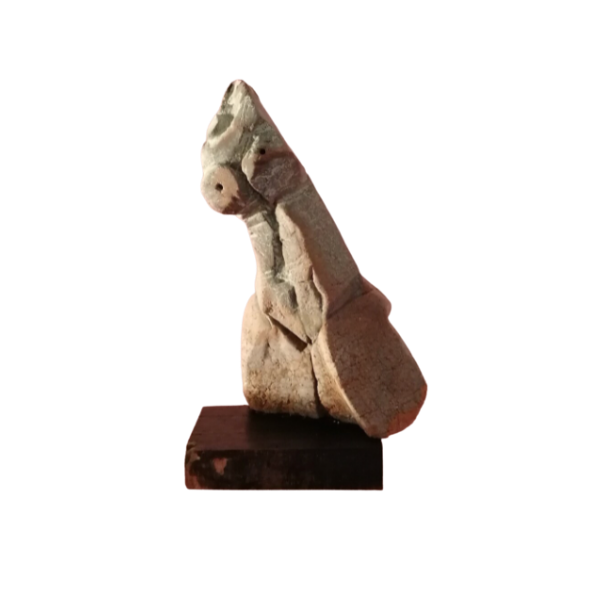
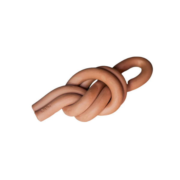
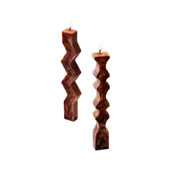
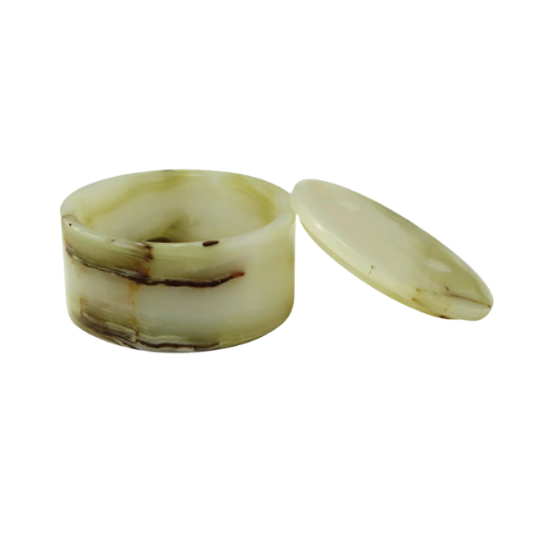
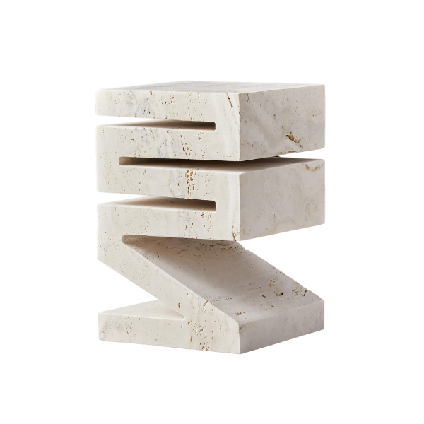
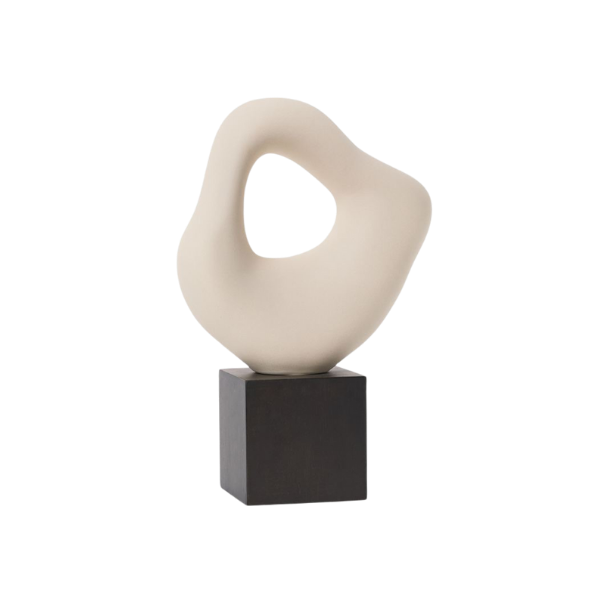
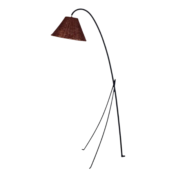
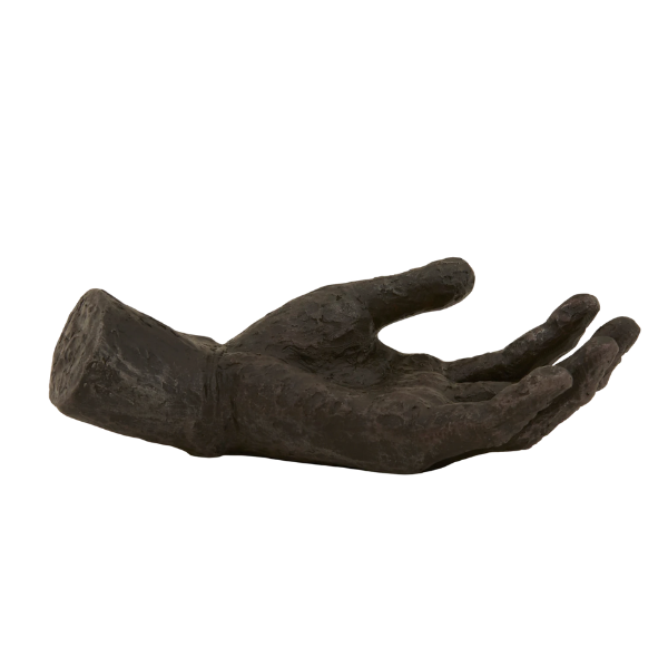
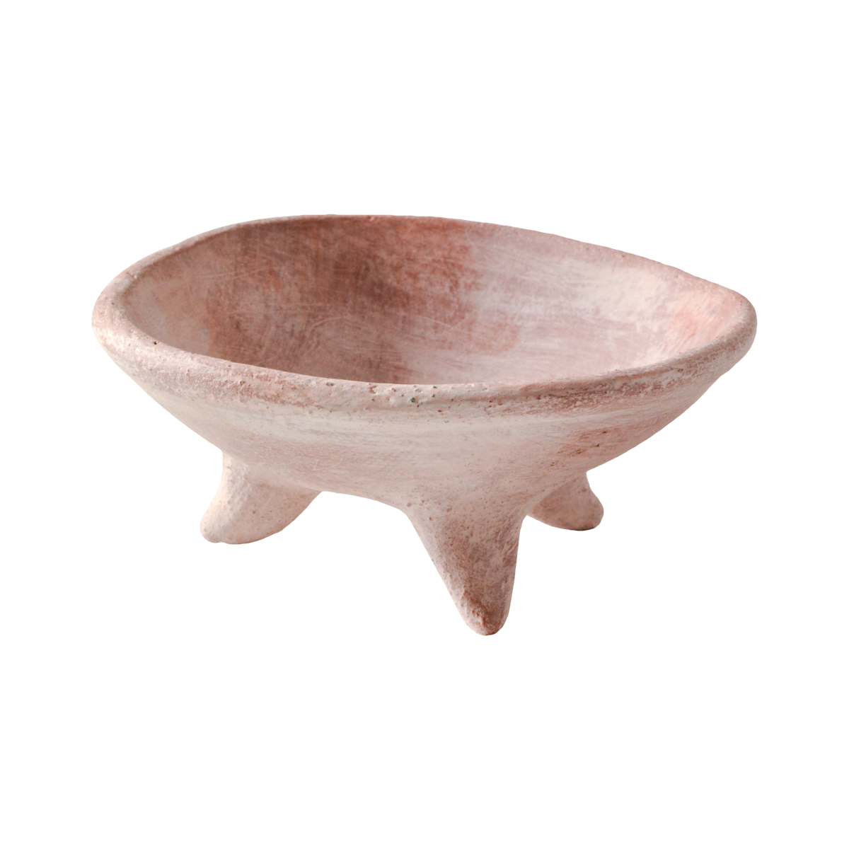
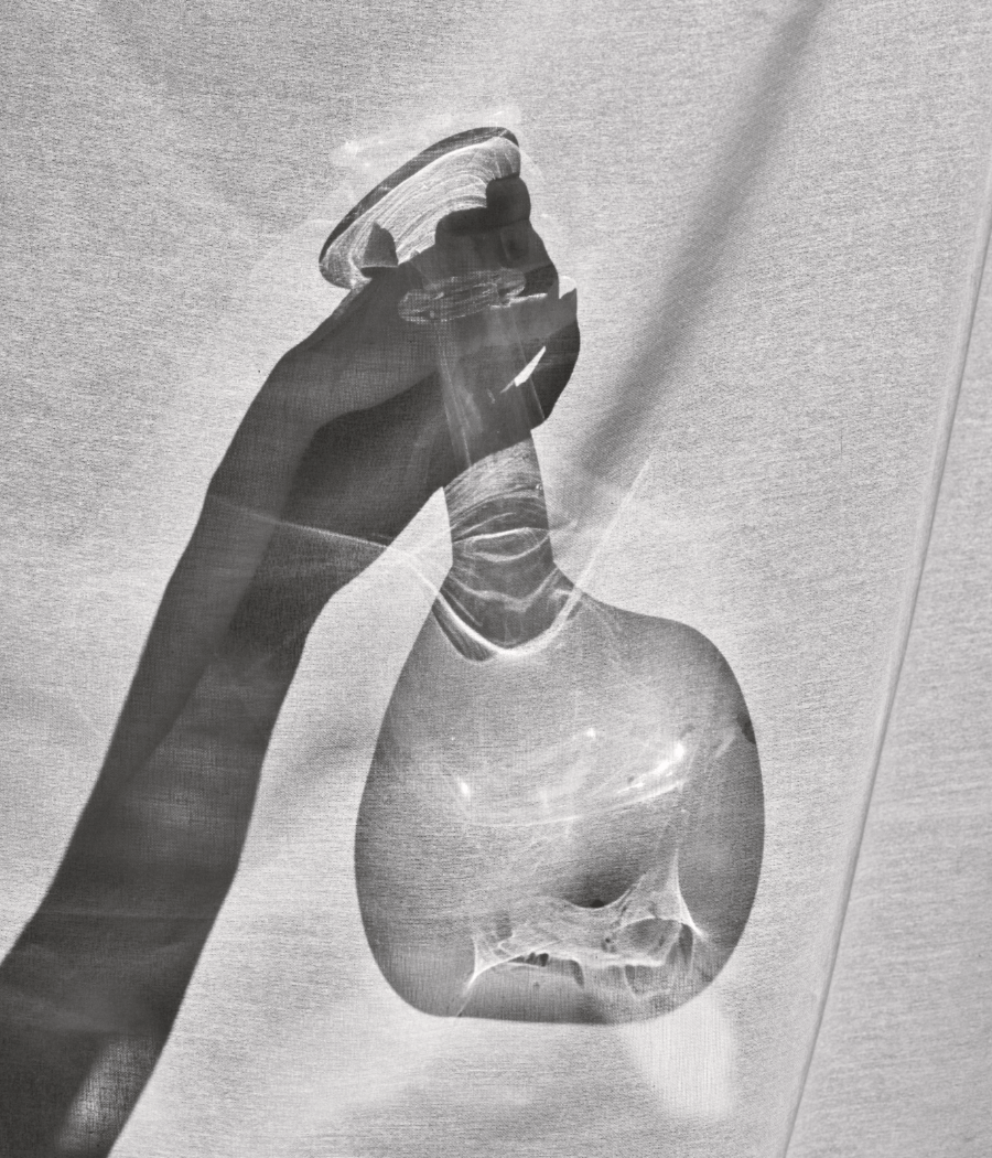
1. Take it moment by moment. For my fireplace styling here, a tall vintage parchment planter is placed on its own to the left, offering vertical interest. Object placement on the right provides differentiation not only in height, but also in color, texture, age, form, and tonality. Vignettes bring a story to the home, forming a narrative in their grouping.
2. Recognize what can stand alone and what needs friends. The planter is a tall, sculptural object that lives happily alone. But the objects on the right, if they were unmoored from one another, would lose their value, looking oddly diminutive in contrast.
3. Consider scale and negative space. Add objects of varying heights and density. Consider the gray area in between and step back from your vignette placement to see it from a distance—assess if everything feels balanced or crowded. Then remove one piece, add another—minus and subtract like this until you feel like it’s landed on the right formula. Play is key!


